【转载】Android自定义ProgressBar
作者:压到我腿毛了
原文链接
以往在使用ProgressBar的时候,大多数都是下面两种情况
数据加载或者其他耗时操作的时候,使用ProgressBar给出一个正在加载的提示框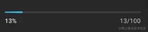
或者下载的时候,显示一下当前正在下载的进度情况。
最近在项目需求中,产品提了一个新的需求,如下
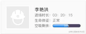
很简单的一个页面,只是,“空吸剩余”这一项有点不一样。首先想到的就是ProgressBar的进度条样式
赶紧xml文件里放上一个看看
  <ProgressBar
    style="@android:style/Widget.ProgressBar.Horizontal"
     android:layout_width="match_parent"
     android:layout_height="wrap_content"
     android:progress="50"/>
样子看起来很接近需求的样式,只是有3个地方需要修改,
<1>.进度条中间需要加上一个当前进度的文字描述
<2>.进度条的当前进度颜色和背景色
<3>.左右两端的圆角弧度;
明白了需求后,接下来就是动手在原有ProgressBar基础上进行修改。在平时ProgressBar的使用中,图1和图2样式上的差距,是因为设置的这一句代码
style="@android:style/Widget.ProgressBar.Horizontal"
直接点进去可以看到系统已经为我们设置好的一段Style
 <style name="Widget.ProgressBar.Horizontal">
        <item name="indeterminateOnly">false</item>
        <item name="progressDrawable">@drawable/progress_horizontal</item>
        <item name="indeterminateDrawable">@drawable/progress_indeterminate_horizontal</item>
        <item name="minHeight">20dip</item>
        <item name="maxHeight">20dip</item>
        <item name="mirrorForRtl">true</item>
    </style>
<item name="progressDrawable">@drawable/progress_horizontal</item>
<?xml version="1.0" encoding="utf-8"?>
<layer-list xmlns:android="http://schemas.android.com/apk/res/android">

    <item android:id="@android:id/background">
        <shape>
            <corners android:radius="5dip" />
            <gradient
                    android:startColor="#ff9d9e9d"
                    android:centerColor="#ff5a5d5a"
                    android:centerY="0.75"
                    android:endColor="#ff747674"
                    android:angle="270"/>
        </shape>
    </item>

    <item android:id="@android:id/secondaryProgress">
        <clip>
            <shape>
                <corners android:radius="5dip" />
                <gradient
                        android:startColor="#80ffd300"
                        android:centerColor="#80ffb600"
                        android:centerY="0.75"
                        android:endColor="#a0ffcb00"
                        android:angle="270"/>
            </shape>
        </clip>
    </item>

    <item android:id="@android:id/progress">
        <clip>
            <shape>
                <corners android:radius="5dip" />
                <gradient
                        android:startColor="#ffffd300"
                        android:centerColor="#ffffb600"
                        android:centerY="0.75"
                        android:endColor="#ffffcb00"
                        android:angle="270"/>
            </shape>
        </clip>
    </item>
</layer-list>
系统是通过图层的方式,在每个 中从上倒下依次对应ProgressBar的
android:background
android:secondaryProgress
android:progress
三个属性进行的设置。
根据需求的样式,我们要对ProgressBar做出修改,也可以参照这段代码进行修改,从需求图中可以看出,并不需要android:secondaryProgress 属性的样式,所以,只修改android:background和android:progress两个属性就够用了。需求中的进度条底色是纯色,上面的蓝色进度是一个由底部到顶部的蓝色渐变,所以,仿照系统的样式,在结合需求,在drawable下自定义一个图层样式文件shape_inner_progressbar.xml
ini复制代码
<?xml version="1.0" encoding="utf-8"?>
<layer-list xmlns:android="http://schemas.android.com/apk/res/android">

    <item android:id="@android:id/background">
        <shape>
            <corners android:radius="8dip"/>
            <solid android:color="#4E4562"/>
        </shape>
    </item>

    <item
        android:id="@android:id/progress"
        android:bottom=".5dp"
        android:left=".5dp"
        android:right=".5dp"
        android:top=".5dp">
        <clip>
            <shape>
                <corners android:radius="8dip"/>
                <gradient
                    android:angle="90"
                    android:endColor="#b2d8ff"
                    android:startColor="#1a85f2"/>
            </shape>
        </clip>
    </item>
</layer-list>
然后在 values/styles.xml 下定义一个Style
  <style name="InnerProgress" parent="android:Widget.ProgressBar.Horizontal">
        <item name="android:progressDrawable">@drawable/shape_inner_progressbar</item>
    </style>
在activity的xml中使用
<ProgressBar
       android:layout_width="match_parent"
       style="@style/InnerProgress"
       android:progress="60"
       android:layout_centerInParent="true"
       android:layout_height="wrap_content"/>
运行起来看一下效果,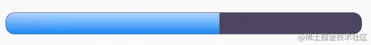
自我感觉很是良好。
现在就差最后一步,在进度条中间设置当前进度的百分比数值。这里就不能直接通过属性值设置了,需要继承ProgressBar并且重写它的onDraw方法,然后通过getProgress()方法拿到它当前进度并且绘制在进度条中间位置,也很简单,代码如下
public class InnerProgressBar extends ProgressBar {
    private Paint mPaint;
    private Rect mRect;

    public InnerProgressBar (Context context) {
        super (context);
        init ();
    }

    public InnerProgressBar (Context context, AttributeSet attrs) {
        super (context, attrs);
        init ();
    }

    private void init () {
        mPaint = new Paint (Paint.ANTI_ALIAS_FLAG);
        mPaint.setColor (Color.WHITE);
        mPaint.setTextAlign (Paint.Align.CENTER);
        mPaint.setTextSize (35);
        mRect = new Rect ();
    }

    @Override
    protected synchronized void onDraw (Canvas canvas) {
        super.onDraw (canvas);
        String text = String.valueOf (getProgress ()) + "%";
        mPaint.getTextBounds (text, 0, text.length (), mRect);
        canvas.drawText (text, getWidth () / 2, getHeight () / 2 + mRect.height () / 2, mPaint);
    }
}
这里需要注意一点的是,为了在Y轴方向上也保持文字居中,需要拿到文字高度的一半,通过和getHeight () / 2一起的和作为绘制文字的Y坐标,至此,整个效果就出来了,上图: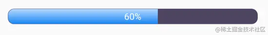
热门推荐
-
 浏览(104)
 -
 浏览(80)
 -
 浏览(78)
 -
 浏览(77)
 -
浏览(76)

关于我
